(01)Port & free-zone authority · North Sea
Port of Halvard
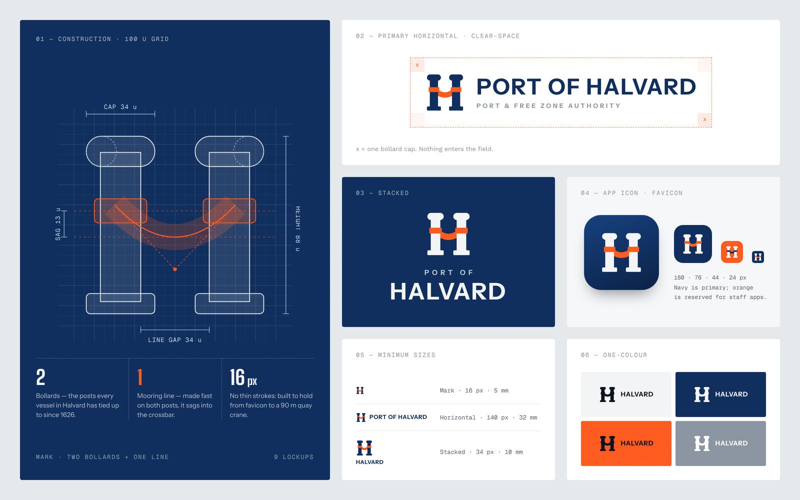
One authority brand for a 400-year-old public port and its free zone — a mark made of two bollards and a mooring line that works on a 90-metre crane, a pilot boat, a gate sign and a 16-pixel favicon.
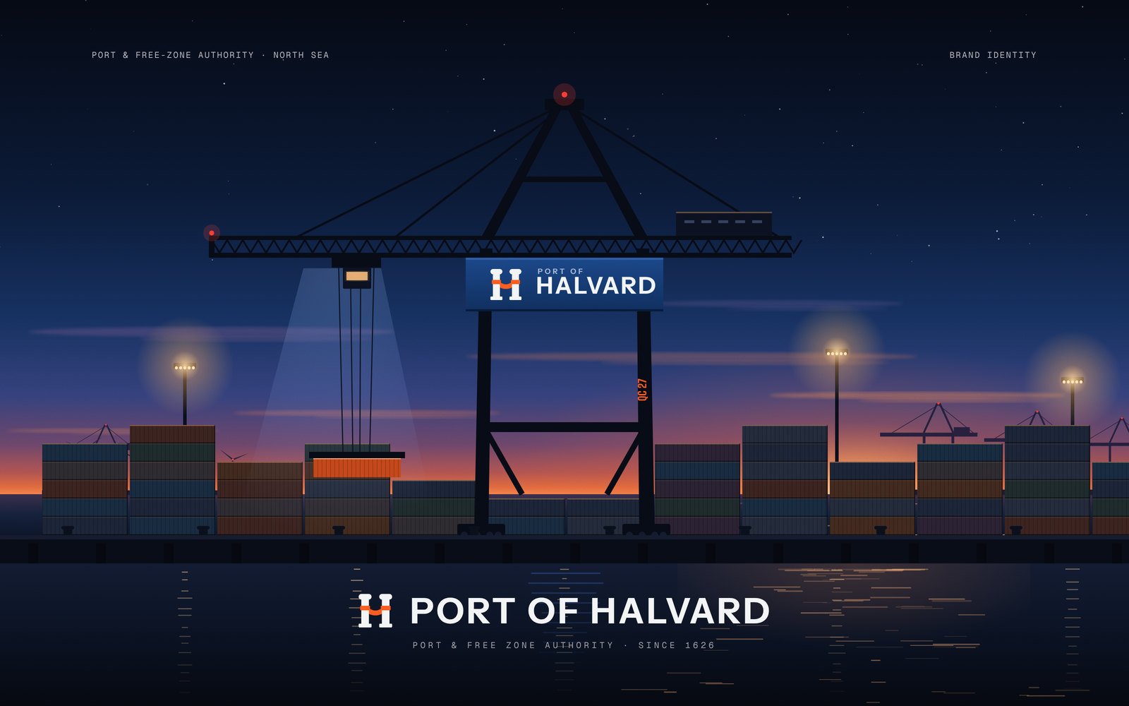
(01)The challenge
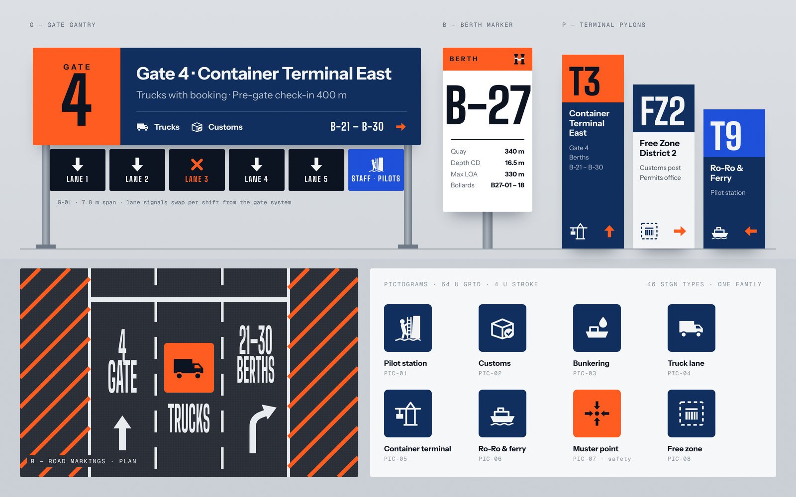
When the port merged with its free zone, it inherited two logos, three colour schemes and signs that truck drivers struggled to read at night.
The new authority needed one identity that could guide ships, trucks and investors alike across 14 terminals and 62 berths.
(02)Our approach
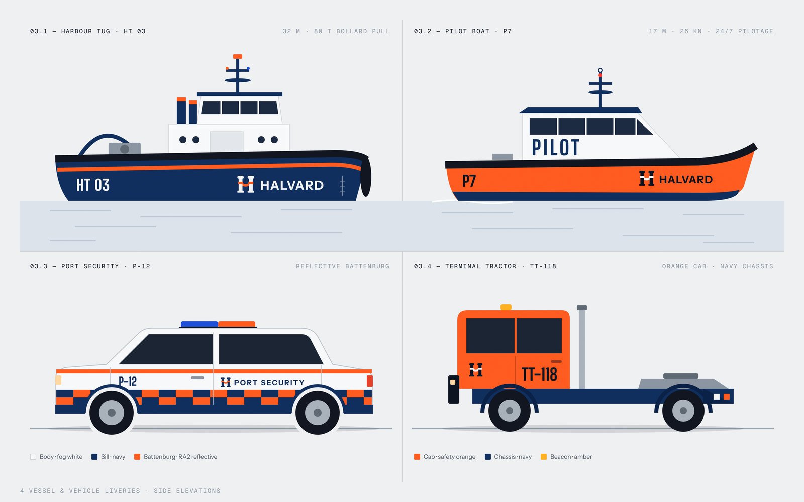
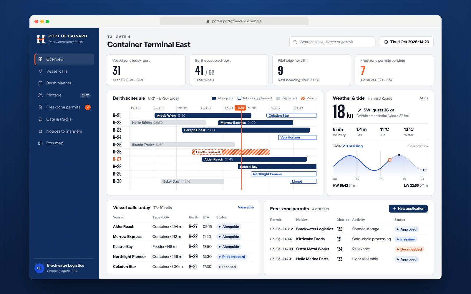
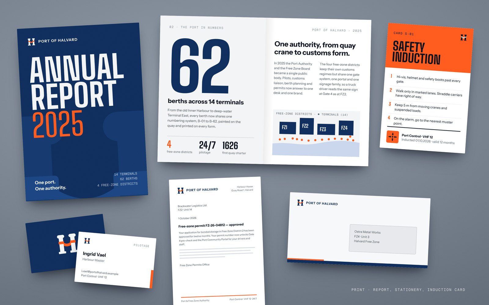
We drew an H from two mooring bollards joined by a line, in maritime navy and safety orange, with a condensed display face built for distance reading. The system covers nine logo lockups, a family of 46 sign types from gate gantries to berth markers and road markings, liveries for tugs, pilot boats, patrol cars and terminal tractors, a port community portal with berth schedules and tides, and the annual report and stationery.
(03)Frame by frame
02 / 05
(04)What we delivered
Logo lockups
Wayfinding sign types
Vessel & vehicle liveries
Next project(02 / 16)
Start a project
Let's build something iconic.
Tell us where you want to be in twelve months. We will show you how to get there.
Start a projectOr write to us directly
hello@voyarx.com